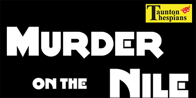
Poster for Agatha Christie's Murder on the Nile
Dead simple image, appropriate 1920s font style, red and black. Murder is afoot.
Click for full image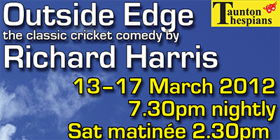
Poster for Richard Harris' Outside Edge
A 1970s comedy set in a cricket pavilion. Blue skies, stumps and a cake all allude to the plot.
Click for full image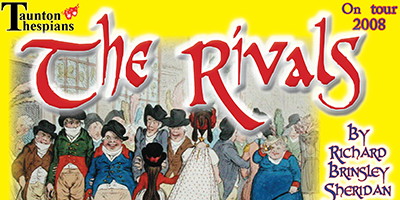
Web banner for Sheridan's The Rivals
A classic 18th century comedy, so a classic 18th century cartoon and an archaic font.
Click for full image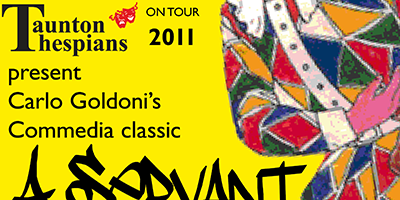
Poster for Carlo Goldoni's Servant of Two Masters
Commedia del'Arte classic, implied chaos in image and font
Click for full image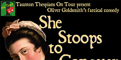
Poster for Oliver Goldsmith's She Stoops to Conquer
Posh girl pretends to be servant. Really pleased to find this image
Click for full image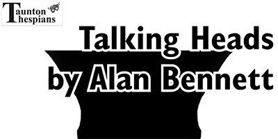
Poster for Alan Bennett's Talking Heads
Budget constraints required mono poster, so kept it very simple.
Click for full image